Oct 14

Creating a Healthcare.gov Web Site that Works

Healthcare.gov

HealthcareBackground on the Healthcare.gov Technology Problems

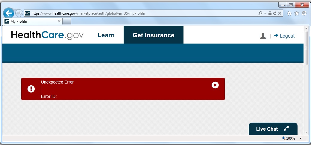
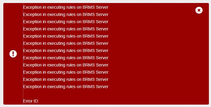
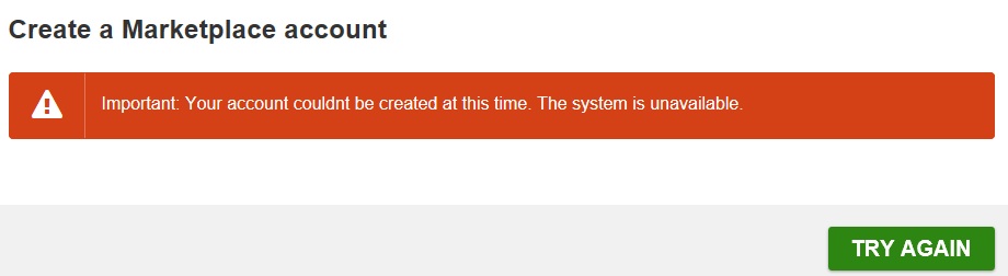
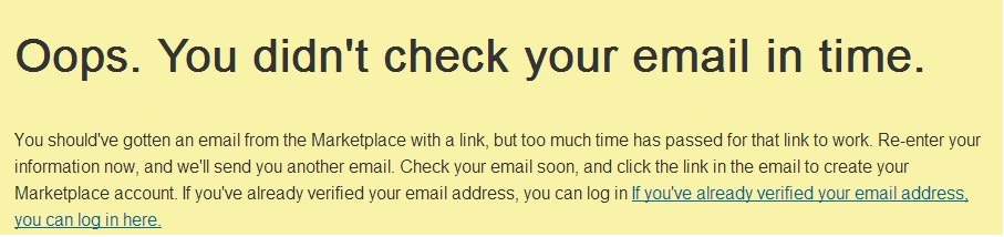
My blog post on October 1st, Healthcare.gov is a Technological Disaster, described my experience using the Affordable Care Act’s Healthcare.gov website on its first day. Based on my experience, I could tell the Obamacare site was a technical mess independent of the number of users on the system. However, “Too many users” was a convenient and politically positive excuse the contractors and administration attributed to the failure of the website. It took about a week before the press began to understand that wasn’t the case. Because of my blog post, I ended up in a New York Times article, the national broadcasts of CBS, CNN and Fox News, and a few radio shows (links are in my prior blog post). I was also invited by the House Energy and Commerce Committee staffers on Capitol Hill to meet them to help them better understand what was and wasn’t working and why.

Solutions for Improving Healthcare.gov

I dislike complainers who don’t offer solutions, so I feel obligated to offer some constructive ideas for creating a functional Healthcare.gov website. I’m not being paid to work on the Healthcare.gov web site and don’t have the actual specifications of what needs to be created, but based on my experience building database solutions and understanding load balancing, I offer the following ideas to consider.

Understanding the Buying Process for Health Insurance

It’s important to understand what the web site should do. The primary mistake the designers of the system made was assuming that people would visit the web site, step through the process, see their subsidy, review the options, and select “buy” a policy. That is NOT how the buying process works. It’s not the way people use Amazon.com, a bank mortgage site, or other insurance pricing sites for life, auto or homeowner policies. People want to know their options and prices before making a purchase decision, often want to discuss it with others, and take days to be comfortable making a decision. Especially when the deadline is months away. What’s the rush?

The existing process acts as if a retail website asked for your credit card number before showing what you could buy and their prices. Almost all sites let you browse without creating a user name. Retailers want you to see what’s available as quickly and easily as possible. People often visit multiple times before buying. Only after making a purchase decision should personal information be collected to complete the transaction.

The web site needs to reflect this and support a more common buying process.

Conceptual Overview

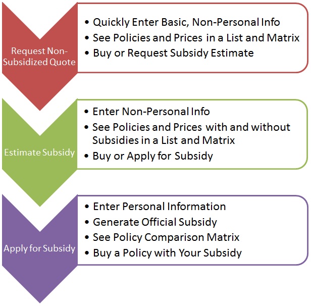
Here’s an overview showing three distinct processes that flow into each other (or people buy a policy at their step and leave the system). A critical part is offering a comparison matrix at each level so consumers can quickly see the differences between the insurance policies.

Healthcare.gov Redesign
(click for larger image)

  1. The first one gives policy options and non-subsidized quotes. People can click to purchase the policy from the insurance company. If so, they leave Healthcare.gov and the government is no longer involved.
  2. The second provides a subsidy estimate and uses the same display as the first but with and without subsidized prices. People can also click to buy the policy without a subsidy and leave the system, or they can officially apply for a subsidy.
  3. The third is the actual application for the subsidy and the only path which collects Personally Identifiable Information (PII). Higher security is necessary for this.

The first two do not require PII and would not require high security. That means a commercial cloud service such as Microsoft Azure could be used to host the site and adjust to high traffic loads. It would support people shopping and browsing multiple times before buying without the need to invest in hardware or bandwidth.

With this improved design, only a small portion of the site’s traffic would be in the final subsidy application portion. That can be isolated with high security and for much lower volumes of users since people would only apply once. Hassling people at this stage with lots of personal questions is acceptable since people are serious about purchasing.

User Experience Goals

These are some objectives for creating a great user experience:

  • Quickly get the unsubsidized insurance rate quotes and policies (no login required)
  • Easily compare among insurance policies based on features and price
  • Easily select and subscribe with an insurance company without a subsidy
  • Quickly receive an estimate of a subsidy without having to provide personally identifiable, confidential information
  • Easily compare among insurance policies based on features and subsidized prices
  • Do not ask unnecessary questions such as race that don’t impact plans, prices, or subsidies
  • Formally apply for the subsidy (login and personal information required)
  • Select a subsidized policy and pass the appropriate information so the insurance company can validate the subscriber’s information and receive the subsidy
  • Once policy options are offered, allow users to create a login to save their inputs, and get back into the system to recover their work-in-progress. This would be required with the formal subsidy application but not necessary for the other options.

Technical “Back Office” Goals

  • Performance: The system should move people through the process as quickly as possible.
  • Collecting Information: It should not ask for any information that’s not required for generating the policy options and prices.
  • Fewer Screens: Rather than having one screen per question, multiple questions should be asked in as few screens as possible. People know how to scroll. Extra screens should only be added if they depend on answers from previous screens.
  • Data Security: The first part of data security is to NOT collect sensitive information. Sensitive information should only be collected from people actually applying for the subsidy.
  • Data Integrity: All database changes need to be in transactions with commitments and rollback on failure. Situations where accounts are partially created with a valid user name and no account details should never occur.
  • No Other Connections During Data Entry: The system should not be connecting to other data sources while the user is entering data. Just collect the data.
  • Offline Processing: Once the user enters all their data for a subsidy quote, a separate system processes the applications and interfaces with the other systems to validate the data and calculate the subsidy. By separating this process from the user’s online experience, problems with connections to other systems do not impact the user.
  • Email Notification: Once a subsidy is calculated, an email is sent to the user inviting them to log into the system to see their options
  • Notification to Insurers: Web pages and web services to allow real-time views of the status of applications selecting the insurer’s policies.
  • Commercial Cloud Hosting: Using a commercial cloud platform would provide automatic scalability to meet fluctuating levels of users without having to make hardware purchases. By eliminating the need to collect and store sensitive user data for most of the website, commercial cloud hosting and its benefits are available without security concerns.

Oversight Goals

Management and interested parties should have system dashboards:

  • Real-time Displays: Monitor user progress with summary tables and graphs showing the status of people moving through different stages of the system.
  • Basic Business Intelligence: Summary and drill-down details by state, date, hour, etc.
  • System Transparency: Provide a public view of some data in a cached mode (updated daily or hourly, but not real-time).

Design Overview

Here is how the goals could be implemented for the Healthcare.gov web site:

  1. The initial form asks people to select their state. If the visitor is in a state that has their own system, ship them to those sites, otherwise proceed with the next step in the federal system
  2. Collect the information necessary to create the unsubsidized options. I was told there were five or so pieces of information necessary to generate the unsubsidized rates (e.g. gender, year of birth, family status, smoking status, etc.)
  3. Display the available plans with options to compare and filter them easily based on plan level (gold, silver, bronze, etc.), provider, price, etc. Should be similar to retail web sites like Best Buy or Staples showing different products and their features in a matrix comparison, with buttons to get more details and a button to select one to buy. One would expect users to come to this site multiple times over multiple days to learn about their options before making a purchase.
  4. An option to save the inputs. This would be the first time to create a simple account to collect user information (which does not include things like social security numbers, birthdates, or names). A simple user name (email address) and password, with a standard email confirmation that doesn’t have a time limit. This would allow users to get back to the previous screen without re-entering their data.
  5. An option to get a subsidized price estimate. If the person chooses this option, they create a simple account because highly sensitive information will not be collected. The account is simply to retrieve the user’s entries. The user provides the information necessary to calculate the prices without having to lookup data from government sources. The user can enter their values for income and whatever other factors impact generating a subsidy estimate. Just like bank web sites let you enter basic information to get a mortgage or car loan rate before you apply, Healthcare.gov should do the same. This would allow the site to create quotes quickly without having to bog down or wait for the other sites such as the IRS, Experian, etc. This minimizes the impact of too many users. Once the estimated subsidies are calculated, a display similar to #3 above would show the options.
  6. Finally, applying for the subsidy. Once someone decides they want a particular policy, they can officially apply for a subsidy. This is the first time personal data needs to be entered. The system should collect the data as quickly as possible without having to validate the information while the user is entering it. Once all the data is collected, the user is informed via email when the subsidy calculation is ready.
  7. A separate background process calculates the subsidy requests and looks up the necessary data from the different sources. If any of those linked systems is unavailable, it’s no big deal since it doesn’t impact the user on the web site. The user is already gone and waiting for an email. Once the calculation is generated (or if it couldn’t be generated), the user is notified via email and they can view the results by logging back into their account.

For management, there should be dashboards with tables and graphs showing what’s happening. No more excuses of not knowing how many people are in each phase of the process, how many have received quotes or enrolled, etc. For transparency, some of this information should be publicly available updated at least daily.

Conclusions

I’m not sure whether the people designing and developing the site will find these suggestions helpful. There’s obviously lots of details not included in my proposal, but I’m confident my basic design is a significant improvement over the original site. It would provide a better user experience, be much easier and faster to develop, easier to test, and more scalable and secure. Was it that tough to envision earlier?

Let’s remember, this website remains the automation of a paper form. It’s not as hard as providing healthcare.

Related Blog Posts:
Too Big to Fire: How Government Contractors on Healthcare.gov Maximize Profits
Healthcare.gov is a Technological Disaster
Media Coverage for Changing the National Discourse on Healthcare.gov
Testifying before the House Committee on Homeland Security about Healthcare.gov
Oct 01

Healthcare.gov is a Technological Disaster

Healthcare.gov

Related Blog Posts:
Who Thinks the Relaunched Healthcare.gov Performance Metrics are Acceptable?
Too Big to Fire: How Government Contractors on Healthcare.gov Maximize Profits
Creating a Healthcare.gov Web Site that Works
Media Coverage for Changing the National Discourse on Healthcare.gov
Testifying Before the House Committee on Homeland Security about Healthcare.gov
Designing a Data Entry System Properly; Overhauling the Healthcare.gov Web Site

Obamacare
Finally Here

October 1, the Affordable Care Act (Obamacare) website http://www.healthcare.gov finally went live today.

I was eager to personally review what was being offered and cut through the hoopla and criticism. I had previously written, FMS Receives Health Insurance Premium Refund from the Affordable Care Act, so my expectations were high.

From the previously published rates for Virginia, the cost of insurance premiums for individuals and families was considerably lower than what FMS currently pays for our group plan. Business plans aren’t available yet, but the individual plans should be a good indicator. I wasn’t interested in the subsidies; I simply wanted to know the prices for the different plan options.

Applying for Coverage

So I went online to Healthcare.gov around 5:30 AM to apply for my family and see what it would cost. As expected, you create a login with email confirmation, and fill out a Wizard to select the options. It’s similar to many other instances I’ve applied online for credit cards and other forms of insurance. How tough could it be? Technically, it’s a very simple data entry application that should generate a quote at the end.

What a Mess!

Unfortunately, what should be a simple process is a complete software technology disaster. The logical flow of the application to register, login, and fill out the data for a family was horrendously inefficient. It seemed like the person who designed it, had never used it. Or maybe didn’t have a family which required filling out the same information for each member of the family.

Just the initial process of creating a login required multiple secret questions and other unnecessary data for getting a quote. Sure that may be necessary for the final acceptance, but it’s a complete waste of time and web resources initially. The system should expedite the process as much as possible to get people a quote without subsidies, then ask for more information to calculate the subsidies if desired. Since I later discovered it never generates a quote, it may not really matter anyway. What were the designers thinking?

Overly Complex Data Entry

As for my family, I not only had to identify my spouse, my two kids, their relationship to me, but also their relationship to my wife, and even their relationship to each other! What? Given the prior information, obvious defaults could be offered. The selection of race was also more complicated than it should be. Here’s an idea that may not have occurred to the designers: Maybe the kids should default to inherit their parents’ races. That’s how inheritance works. And does race impact pricing? If not, why ask?

The system crashed several times for me and had problems when I logged back in. It seemed like the system wasn’t even tested. Here are some screenshots:

Screenshot 1: Gibberish

(click the graphic to see an enlarged version)

What the hell is that? How could that get through testing much less production?

Screenshot 2: Error form with no data

healthcare2

Having error handling to catch unexpected crashes is a Best Practice in application development. It should tell the user what went wrong, what to do next, and gracefully exit the system. This page does none of that. The error message and error number are blank. Who knows what went wrong? Useless and amateurish. They do have a Live Chat button. I wonder what I would chat with them about with this crash.

Screenshot 3: Cascading errors

healthcare3

In this screenshot a series of errors appear to be triggered without meaningful explanation. Embarrassing.

Logging Back in and Repeating

If anything, I’m persistent. I not only had my original goal to see the premium prices, I was now intrigued to discover how poorly designed, developed and tested this application was. Eventually, I was able to finish. Took about an hour.

However, rather than receiving a quote immediately, it’s now being “processed”. For what? It shouldn’t be held up for pre-existing conditions which ACA eliminates. I would expect it to be some mathematical, logical formula that would generate the results. I presume it’s because that part of the application isn’t built yet. Although my application is submitted, given the crashes, I’m not sure what data it has. We’ll see.

Authors of Healthcare.gov

A few months ago, I read this article about how the site was being built and was impressed: Healthcare.gov: Code Developed by the People and for the People, Released Back to the People

In hindsight, it appears the authors have a philosophical bias toward OpenSource and “people power.” That’s all fine and dandy if it works, but this site doesn’t. To deliver such low quality results requires multiple process breakdowns. It just proves you can create bad solutions independent of the choice of technology.

Technical Software Conclusions

What should clearly be an enterprise quality, highly scalable software application, felt like it wouldn’t pass a basic code review. It appears the people who built the site don’t know what they’re doing, never used it, and didn’t test it.

I actually experienced many more problems than the screenshots I captured. Had I known I was performing a Quality Assurance assignment, I would have kept better documentation of typos, unclear directions, bad grammar, poorly designed screens, and other crashes. My bad!

It makes me wonder if this is the first paid application created by these developers. How much did the contractor receive for creating this awful solution? Was it awarded to the lowest price bidder? As a taxpayer, I hope we didn’t pay a premium for this because it needs to be rebuilt. And fixing, testing, and redeploying a live application like this is non-trivial. The managers who approved this system before it went live should be held accountable, along with the people who selected them.

Custom Database Software Application Development

Our Professional Solutions Group has created many mission-critical, custom software applications where scalability, reliability and quality are paramount. For instance, we built the Logistics Support System for International Humanitarian Relief for the United Nations where lives are dependent on accurate, timely data on a global scale.

Link Analysis with Sentinel VisualizerWe’ve also created a database link analysis program for the intelligence and law enforcement communities.

I know what’s involved in creating great software, and this ain’t it. Healthcare.gov is simply an insurance quote system. As a software developer, I’m embarrassed for my profession. If FMS ever delivered such crap, I’d be personally inconsolable. This couldn’t pass an introductory computer science class.

Overall Conclusions

This is going to be a huge public relations mess that could doom the whole initiative. Maybe they can blame the problems on too many users even if that weren’t the real cause, but it’s not going to be fixed with a few weekend tweaks and throwing more hardware at this. The application process asks too many unnecessary questions and repeatedly crashes. Since 9 AM and as of this evening, the site no longer lets you apply. I presume it got overloaded or someone finally discovered how broken it is and pulled the plug. Given what I experienced, it needs to be offline until it’s corrected. Meanwhile, I’d be highly concerned about the security of the data people enter given all the crashes I encountered.

Of course, software problems with the application process are not the reason to abandon healthcare reform. As a small business owner, we face the highest premiums for the lowest coverage. I applaud the efforts to reform health insurance and look forward to working in a constructive, rather than destructive, manner to improve this. I presume once these issues are resolved, I’ll have more options for my company and employees than I did before. In the big picture, this website is much easier to fix than health insurance. We’ll see.

Because I don’t like to complain without providing solutions, I added this blog post on October 14th:
Creating a Healthcare.gov Web Site that Works


New Attempt on October 5

I thought I’d give it a new try on October 5th to see if my initial impressions were wrong. I decided to create a new account to start all over. I had forgotten how difficult it was to simply create a login.

First it requires an overly complex login name that: “must contain a lowercase or capital letter, a number, or one of these symbols _.@/-“, which is confusing based on how you apply the OR clause. A clearer and simpler instruction would be to say: “must contain letters AND at least one number”. The unclear instructions cannot be blamed on too many users.

Then, it required three secret questions just to create the login. Not sure why any would be necessary. On Day 1, I got an email to confirm my login. Today, I got this screen after the last screen: Your account could not be created at this time. The system is unavailable

healthcare5

It lost all the data I entered. This is a clear web interface and database design problem if they didn’t store any of my information from multiple screens prior to the Finish button. A basic rule in database applications is to never lose data. Maybe you can lose data if the current screen crashes, but there’s no excuse for losing data from previous screens….unless of course, you haven’t thought about it before.


Another Attempt on October 7

I must be a glutton for punishment. I went back in to create my login. Unlike two days ago, I didn’t get the system unavailable message. It told me it was sending an email to confirm my login information, and I actually received the email. Woohoo!

Unfortunately, because I’m trying to run a business, I didn’t respond to the email until 30 minutes later. When I clicked on the link, I got this Oops. You didn’t check your email in time message:

Oops You Didn't Check Your Email in Time

Are you kidding me? It would have been nice to mention that in advance. Did they really invest programming resources to design and implement a feature that requires a response to the email confirmation right away? How user hostile can we get? Most sites would offer at least 24 hours or FOREVER to respond since nothing secure has been entered yet. I need to re-enter everything again. This just adds to their user load.


Application Status

FYI, my submission on the Healthcare.gov site on October 1st remains IN PROGRESS. No price quote, no email. Nothing. Just the same status online:

healthcare-status-NoID

October 15th: I visited the site again and saw the same screen. I didn’t realize it, but if you click on the text to the left of the status, it’s a hyperlink that brings you to another page:

Healthcare Application incomplete

Imagine my shock to read “Your application is incomplete”. Darn! Could I have missed something on the first day that required me to re-enter or add more information? I don’t consider “Incomplete” the same as “In Progress”. It should have emailed me if it needed more information and certainly shown it on that screen.

I clicked on the “Continue Application” button to see what was missing. It turns out the same irrelevant, time consuming questions were asked for myself and each family member. I also found a few more bugs with problems going backwards, and selecting the address of each family member from a growing list of identical addresses. I also encountered new questions asking whether I am a Native American, and some strange question about my children’s relationship to each other (asked for each child) that I still don’t understand:

healthcare-sibling-relation

Can I get a sponsor for my child? I didn’t bother to investigate the definition of each of those terms before selecting “None of the above”, but it was bizarre and confusing. I definitely don’t remember answering this before. Eventually, I got to the end and was able to submit the completed application with a digital signature page I didn’t recall before. So maybe my application is going to be processed now. I went back to the status form and saw that I was “In Progress” again.

Then I clicked on the hyperlink next to the left of the Status and discovered the same “Your application is incomplete” screen. Did anything change? I think the message should say “Our application is incomplete”. Ugh!

Update for October 28th

My application is still “In Progress” but also incomplete. I went through the process again. Some bugs appear to be fixed since the last visit (duplicate lists of addresses are gone along with misnumbering family members). Still had many unnecessary screens that were shown but could not be edited (for instance, relationship between family members).

The administration has announced that the system will be fixed by the end of November. My belief has been that if the right team were in place and they could control the end-to-end process and design, this system could be built in a month. I hope they get it right and their families understand why they won’t see them over the Thanksgiving weekend. Good luck!